Chart Types
In this documentation, we provide an overview of various chart types available in Hashboard.
Bar, Area, Line Charts
Bar, Area, and Line charts all work very similarly in Hashboard. These chart types are all designed for exploring time series Measures as defined in your Data Models.
Bar charts represent data with rectangular bars. The height of the bars is proportional to the measure values they represent. Bar charts are a good default for a single measure time series. They clearly communicate granularity and it is easy to spot when there is missing data or the value is zero.
Line charts represent data points connected by a line. They are useful for comparing series values directly against one another. e.g. comparing call volumes between departments.
Area charts are similar to line charts, but fill the area under the lines. Area charts emphasize the total area taken up by a series. They work particularly well for charts showing proportional changes of a whole over time.
Hashboard also supports the ability to layer multiple mark types together in a single chart. The example above has separate y-axis for each series of data.
Horizontal Bar Chart
Horizontal bar charts are extremely effective data visualizations for comparing total values across categories.
Make sure to pick the right sorting for your viewers. Should you sort by the the category names or the measure values? Our other chart types are naturally sorted by time, but here you need to be a bit more careful.
Table
Hashboard tables provide powerful options for visualization, formatting, and grouping. Tables are often the best option when comparing multiple Measures and breakouts at the same time.
Pie Charts
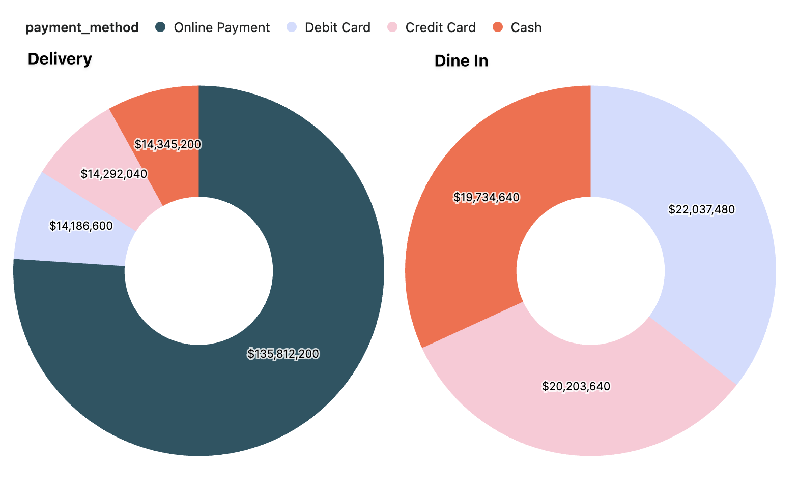
Pie/donut charts depict proportional relationships, and are suited for illustrating percentages and distributions of categorical data.
Source Data Table
Source data tables show the underlying data from your data warehouse. They provide raw data that can be used for further analysis or exported to other tools.
Hashboard automatically makes URLs in source data tables clickable.
Map (beta)
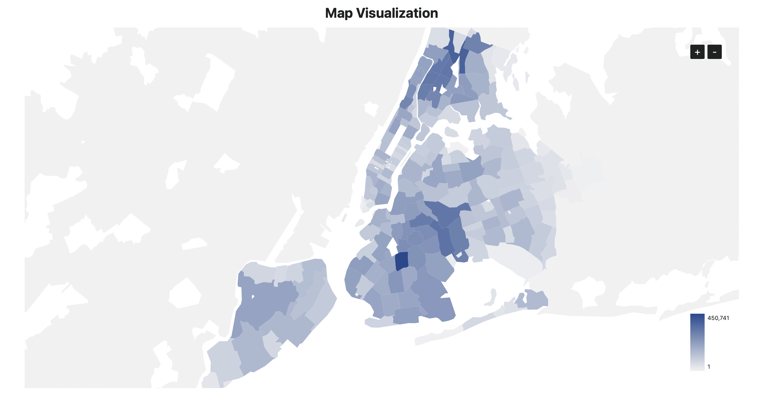
Maps allow you to visualize measures by geographic regions, such as zipcodes, counties, and states.
For access to this beta feature, contact the Hashboard support team at support@hashboard.com.